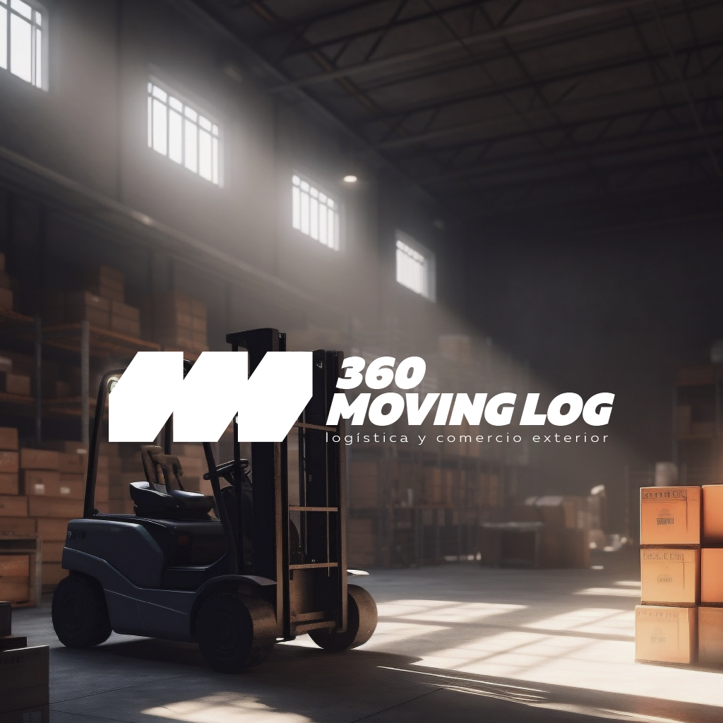
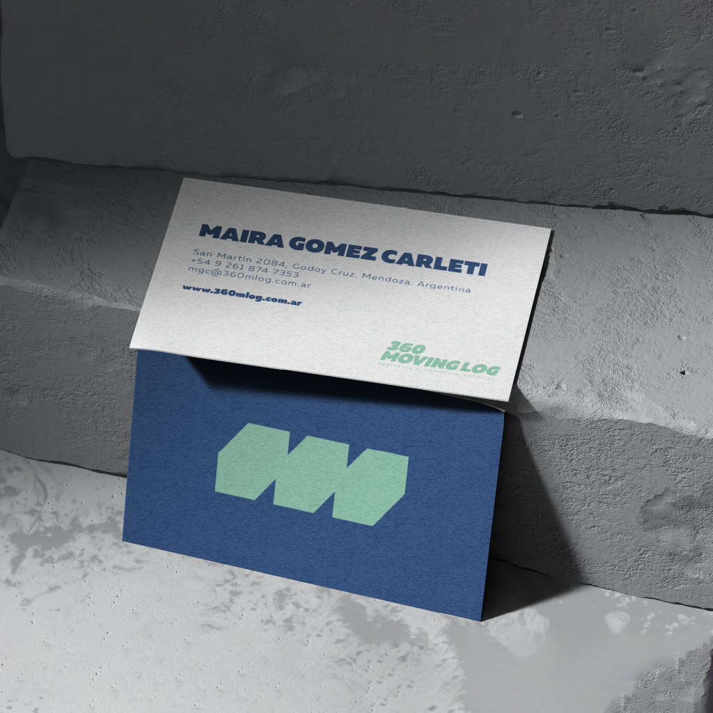
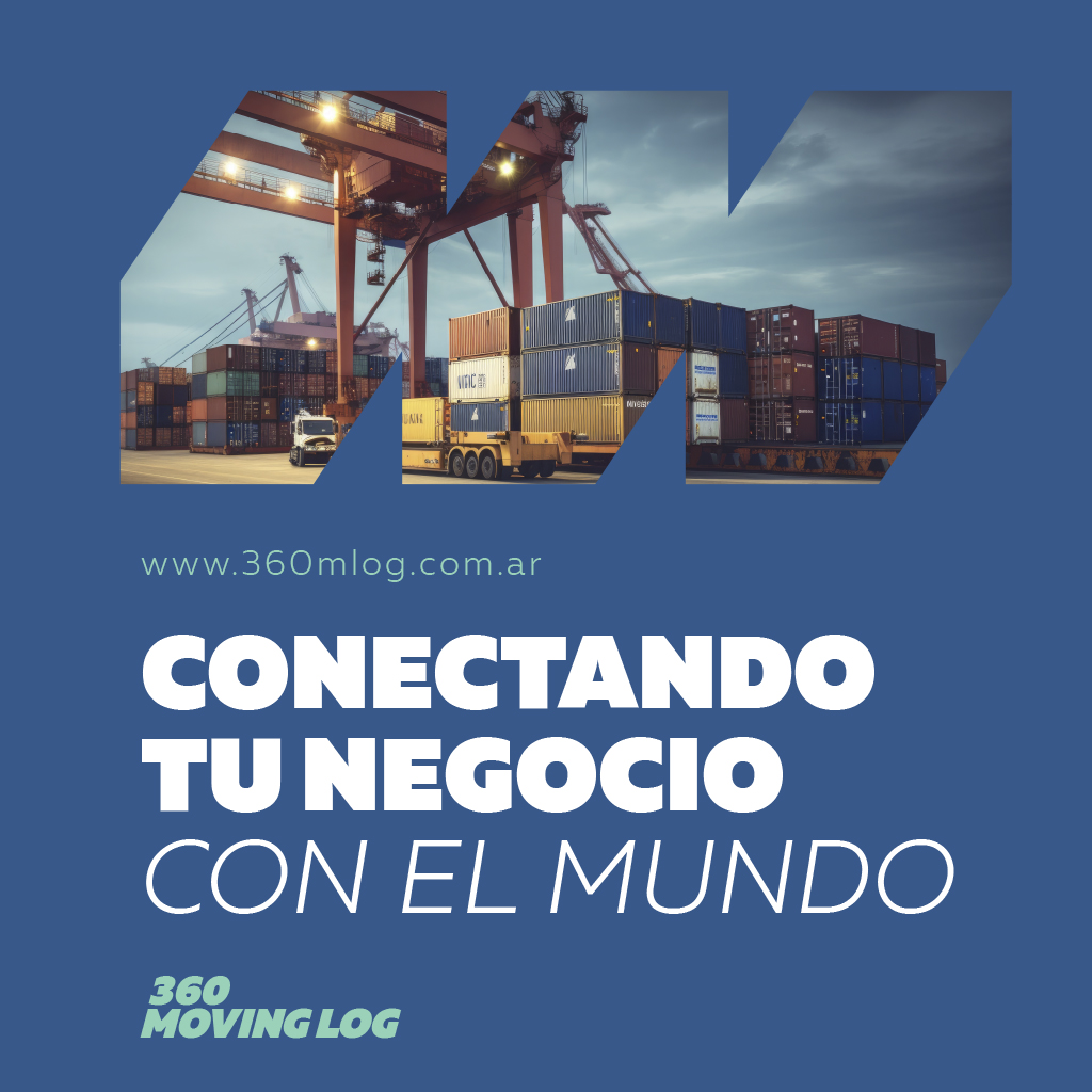
360 Moving Log is synonymous with efficiency and dynamism in international logistics. The brand was designed with a brutalist style in the typography, reflecting strength and determination. The slanted letters suggest constant movement, symbolizing the ability to keep clients’ operations running smoothly. The isologo, a simplification of the ‘M’, captures the essence of movement, fluidity, and progress, highlighting the commitment to innovation and adaptability in the logistics industry. The blue and aqua green colors represent not only trust and stability but also a connection to the environment and renewable energy.